
Good design requires a solid understanding of a core concept or value. No more obvious is this than in branding. If a company’s brand is its core concept, its soul, then its logos and marketing are its voice. And that voice is responsible for communicating the brand.
I’ve written before about how difficult it is to communicate who you are to people. Everyone is different, everyone hears things differently and everyone expects different things. Thus, it’s not surprising that we have difficulty communicating with everyone. The same is true of brands, except they need to communicate with everyone. So, as a company, if your voice isn’t providing the right messaging – or worse, if your brand isn’t fitting in – then you’d think it’s time for a change.
When companies change their logos, you have to figure that something prompted the redesign, something wrong within the soul of the business. But changing logos is more of a marketing thing; it’s a lot harder to change the core value.
You can usually find out a great deal about company logos if you just do a bit of research. Learning about the time period the logo was made – the political environment, the current state of affairs, etc. – and putting all the pieces together, you can get a much deeper understanding of what is going on here.
Take mayonnaise, for example. It first became popular in the U.S. at the turn of the 20th century. But ask someone from the west coast to name the brand of mayonnaise they use and then ask someone who grew up east and they’ll say different things. That’s because while Helmann’s mayonnaise was the staple brand on the east coast, Best Foods Inc. introduced and grew its mayonnaise business in the west. And although in the 1930s, Best Foods acquired Helmanns, to this day, they maintain the branding of Best Foods west of the Mississippi and Helmann’s east of it.

It’s the same brand, the same product, heck even the visuals of each logo are the same! But the marketing is different. And that’s because marketing, as a voice, is regional; it depends on context. Branding, on the other hand, is universal and timeless.
Because the brand is at the heart, it’s important that the marketing clearly speaks to you, the user. And if the marketing is ineffectively communicating the brand, it’s time to change something. Often times, old logos convey only one area of focus but as companies expand, their brand may cover others as well. When the Sci Fi network, for example, started struggling as a science-fiction, typically male-oriented TV channel, they felt a good way to stay afloat was to expand. Now they offer social components, applications and a bunch of new programming that appeal to a broader audience. As such, they needed to redo their logo to be less about science fiction only. The new “SyFy” accomplishes this, losing its unique and overt galactic/spacey style – not to mention the obvious reference to science fiction – in favor of one that’s more generic, universal and a bit amorphous.

Sci Fi’s transition to SyFy
But simply changing the SyFy logo isn’t going to change the fact that their brand is clearly struggling as a small, targeted, “old-media” network (just like many other Hollywood / TV brands). The real success will be if they can figure out how to give people what they really want in a new world of technology that provides users with virtually anything they want whenever they want it.
Broadening a brand isn’t uncommon. Along the same lines as SyFy is Walmart, whose original logo design, a tad on the cliché and cheesy side, focused on cheapness and targeted low-income families. But lately, Walmart has started to sell higher quality items, more variety and targets more of the middle class. As such, their logo revision is more elegant, modern and extra curvy to convey a sense of friendliness. The logo graphic may remind you of an asterisk or otherwise, but maybe that’s a good thing (especially when you consider that asterisks can denote “mark as important”).
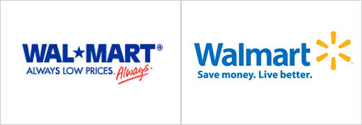
Walmart’s new friendly, modernized logo
Now let’s move to Gap, a global company which owns a variety of clothing lines, including Banana Republic – the upscale, high quality branch (that, incidentally used to be branded as tropical / Caribbean fashion) – as well as Old Navy. But when Gap first started as a small basic clothing line in the end of the 1960s, it was new, hip, stylish, clean and fun. And its logo represented that brand presence.
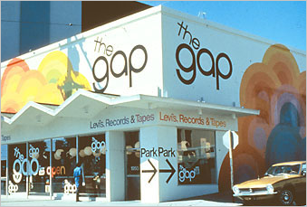
The original Gap logo from 1969
But these days, with the advent of many popular hip/stylish clothing lines, people tend see the Gap more as generic, poorly-made clothing. It’s not generic that’s bad – American Apparel is all about making generic clothing super cool. Although their clothes are well-made, they’re not really anything particularly special and its logo reflects that brand: basic, black, Helvetica. But just because Gap adapts a similar logo style doesn’t mean that its core essence as a brand has actually modernized and become more hip. The products and the experience have to show it.
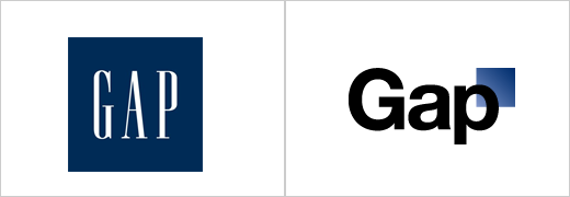
The new Gap logo, very American Apparel.
I suppose we’ll see what happens, but in the meantime, the design of the Gap logo isn’t very effective. Among its poorer qualities is the black text over a blue square (that isn’t even fully saturated, the blue running like a bad dye job). What does this mean? What does its color and placement mean? And perhaps most importantly, how does this logo look in black and white, especially when it’s going to be woven into a clothing label that allows only one thread color, not to mention a resolution of only 72 dpi?
I should note that designs should never rely on color to help convey meaning. Rather, the color should just serve to enhance the structure or shapes that already exist. The only exception to this rule is when color is used to discriminate between sub-brands, which Gap has a chance to do here, potentially. Because sub-brands are geared towards a specific context and/or audience, they are aspects of marketing, the voice of the brand. Here, it’s okay to change the aesthetic, in the same way you might change what you say or what you wear depending on who you’re hanging out with. It doesn’t change who you are or what you believe in fundamentally, but it does help you be more effective at communicating with different people.
Good examples of this can be seen in the Huffington Post, USA Today, FedEx, Adobe and even milk. Milk is among the few food products where you accept its genericness. After all, the hugely popular “Got Milk” campaign isn’t about any specific brand of milk. Milk is milk. But there are different kinds of milk and for years, colors have been used to separate them out: red is whole milk, blue is fat free, etc.
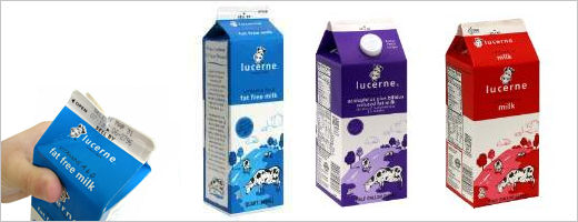
Lucerne milk uses simple packaging with vibrant colors to differentiate the milk varieties.

The many different sub-brands of Fedex, separated by variations of color in their logos.
But while we accept milk as a generic food item, we don’t do the same with other staples. Take orange juice, for example. All orange juice isn’t the same; it depends on where the oranges are from, how they’re processed and when they were grown, among other things. Because of these unique characteristics, branding is much more important to distinguish one orange juice from the next.
Tropicana first emerged in the 1950s, back when it was especially difficult in mainstream society to have really good, fresh juice all the time. The founder developed flash pasteurization and it was the first time consumers could have the fresh taste of oranges from non-concentrated juice. It was new, exciting, exotic. And, as such, its logo reflected that. Giving the Tropicana wording an almost clichéd, decorative font made it stand out more and make a name for itself.
But when Tropicana recently modernized its logo and branding, there was an immense public outcry – so much so, in fact, that it is among the few redesigned logos to be recalled.
Although there were some good decisions in the Tropicana rebranding (such as picking a font that may be more universally understandable than its previous faux-Americana-tropical one), modernizing it just made it look more generic and basic. No one wanted generic orange juice; they wanted Tropicana. It lost its unique personality and with that, its trust from its customers.
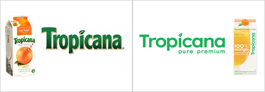
Tropicana’s generic new design
A sudden branding redesign to a company you trust is like pulling out the rug from under you. It’s shocking, unexpected, uncertain. A logo and a brand implicitly tell a story and give an experience. Gap used to have a story and experience. They’ve changed the logo, but have they changed the experience? A logo change is simply just tricking people to think the whole company is different. If it really is, then great, but most brands have a hard time changing, just as most people have a hard time changing. Lest we forget, a pig with lipstick is still a pig.
Marketing, as a voice, is regional; it depends on context. Branding, on the other hand, is universal and timeless.
So why are we so big on trust? Why is the branding so important? And why do we tend to hate redesigns? It’s because it gives us a consistency, a constant to grab onto. And the more consistent a design, the better we understand it and the more we build expectation and come to trust it. As humans, our strongest emotional responses map to behavioral patterns learned before we could even form memories. The first few years of our lives are the most formative and we learn a slew of severe life lessons during this time, perhaps most importantly discovering that the world is made of things that can always change. Inherently craving stability, we learn to look for things that are constant and latch on as we develop heuristics to help us grow. We strongly desire a sense of place, of security, of safety in things we come to trust. It’s the second most basic tier of Maslow’s hierarchy of needs, right after food and shelter.
Just as you have experiences in life that affect your learning and perceptions, so too do you have them with brands. And if you want to form a bond through these experiences you have repeatedly, then they should be consistent and expected because trust is involved.
Even if you think some of these logo redesigns are better, the bottom line is that every one of them is really just a change in marketing, with many of these companies trying to be something they’re not [yet]. A logo and a design make a promise to its users of upholding an implicit experience and story. And when a company’s brand is undergoing a state of flux, the worst thing they can do is put out a bad logo that makes a promise they can’t actually keep.